There are a number of different types of graph that you can use in statistics. The question you will sometimes need to answer is:
Which one should I use?
There are a number of situations where you will be told exactly which graph to use - for example, if it is a histogram, scatter graph, or cumulative frequency diagram.
However, we have to be able to decide between the four other types - bar charts, pie charts, pictograms and vertical bar charts.
The advantages and disadvantages of each type
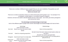
Each of the different types of graph have certain advantages and disadvantages, let's look at them:
| Advantage | Disadvantage | |
| Bar chart |
Clear and easy to read Good if you have two sets of data (dual) |
Does not show proportions |
| Pie chart | Great for comparing proportions |
We don't know the exact values of each piece unless we are told it Shouldn't be used for grouped data |
| Pictogram | Good visual impact for simple data | Can be difficult to read accurately due to not being able to split pictures up |
| Vertical bar chart |
Clear and easy to read Good if you have two sets of data Quick to draw |
Does not show proportions |
Types of data
There are two types of data: discrete and continuous data.
Discrete data is things that can't be split up into smaller units (eg. colour, shoe size, rooms in a house).
Continuous data is things that can be measured on a scale (eg. height, weight).
Continuous data should be displayed using a bar chart or vertical bar chart.
Discrete data can be displayed on any of the graphs.
Let's have a go at some questions now.


