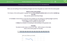
When you are looking at how something changes over time, the graph you need is the time series graph.
What is a time series graph?
Put simply, a time series graph is a graph that has time along the bottom axis and another variable up the side.
They can be used to find three things:
1) The trend. A trend shows if, over time, the variable you are looking at is getting bigger (positive, ascending) or smaller (negative, descending).
2) The value of the variable at a given time.
3) When the variable is increasing (or decreasing) at the greatest rate.
Example:
The data for birth rates in China from 1950 - 2010 is shown in this table.
Draw a time series graph for the data.
a) Describe the trend for the birth rate in China over time.
There is only one of two words you need here - increasing or decreasing. As the trend for the graph is downwards, we describe this as a decreasing trend.
b) Estimate the birth rate in 1972.
If we read up from 1972 on the graph and then read across, we get the answer of 5 children per family.
c) Between which two years did the birth rate decrease the fastest?
This is actually easier than it sounds. All we need to do is to look for where the line is the steepest.
This would be between 1970 and 1975.
Now, it's over to you.


