What do you imagine when we say 'box and whiskers'?

Maybe you are thinking of a cat - but if you have maths on your mind, it's got to be a box-and-whisker plot!

Also known as a box plot, it is a handy way to represent data, especially when we are interested in the middle 50% of the data (i.e. the box)!
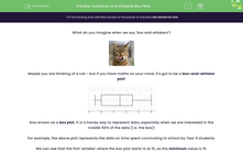
For example, the above plot represents the data on time spent commuting to school by Year 9 students.
We can see that the first 'whisker' where the box plot starts is at 15, so the minimum value is 15.
Similarly, the other 'whisker' where the box plot ends is at 60, so the maximum value is 60.
The box represents the middle 50% so it starts at the lower quartile (20) and ends at the upper quartile (45) with the median (35) being somewhere inside it.
.jpg)
Let's remember that the lower quartile (Q1), median (Q2) and upper quartile (Q3) divide the data into quarters:
Lower quartile = 1st quartile (Q1) = 25th percentile, i.e. value that 25% (one quarter) of the data are smaller or equal to - this is the median of the lower half of the data
Median = 2nd quartile (Q2) = 50th percentile, i.e. value that 50% (two quarters) of the data are smaller or equal to
Upper quartile = 3rd quartile (Q3) = 75th percentile, i.e. value that 75% (three quarters) of the data are smaller or equal to - this is the median of the upper half of the data
In an exam or with your school work, you might be asked to read these values off a box plot.
You also need to know how to construct the plot both when you are given these five values and when you need to find them first yourself!
.jpg)
Let's have a go at some questions!


