In this activity, we're going to compare information presented to us in pie charts.
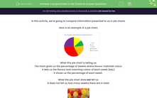
Here is an example of a pie chart.

What this pie chart is telling us:
The chart gives us the percentage of sweets where flavour matched colour.
It tells us the flavour and matching colour of each sweet (key).
It shows us the percentage of each sweet.
What the pie chart does not tell us:
It does not tell us how many sweets there are in total.

So, what questions can we ask and answer about this pie chart?
We could ask the question 'Did more strawberry sweets match the colour than lime sweets?'
We can see that a bigger percentage of the pie chart is red (strawberry flavour) than green (lime flavour), so we know that more strawberry flavoured sweets matched the colour than lime.
Now it's your turn to answer some questions.


